Check out the pros and cons of Rationale: an argument mapper for Windows. Conclusion? It’s a nifty addition to any journalist/blogger/critical thinker’s software toolbox.
Chicken and egg, form and function, structure and agency: when I’m writing, I’m pretty certain that in order to be creative, to make something new, I need an argument, a structure, first. Without a sound argument, staring at the screen, blinking in time with MS Word’s cursor, I’m struck by a vast, chin-stroking, procrastinatory, angsty agony. Blinks. Strokes chin. How to start?
Go figure, hippie permissives: for me, mapping out my arguments in geekish detail isn’t so much about control freakery, it’s more about providing the foundation for the spontaneity needed for playing around, for creative thinking.
For the last couple of months, I’ve been using an argument mapper called Rationale to do this. At first click, Rationale doesn’t give the impression of having much to do with creativity. It produces analytical argument maps. It’s about being critical, rational, inductive, deductive, logical, oh my.
Working with Rationale

Rationale works by helping to break down an argument into its component parts. Its aim is to encourage critical thinking. As the argument’s unstated assumptions come more clearly into view, the argument becomes easier to evaluate. It’s a cinch then to hammer the weak spots and, oh yes, concentrate on awing the world with your awesome creativity etc.
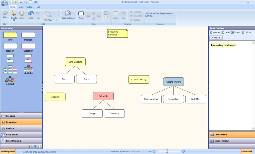
Launching Rationale, pausing slightly to ooh-aah over its candy-coloured eye candy, its marshmallow-flavoured GUI, I begin with some gentle brainstorming. Getting key ideas up onto the screen, I want to get an overview of my understanding of the issue, spit out the concepts which string the issue together for me.
Full points to Rationale as a brainstormer. It passes the crucial brainstorm application test: entering data doesn’t lead to any break in focus. A tap on the screen produces a blank item; pressing enter, a new item alongside the first one; pressing insert, a new child item for the last one created.
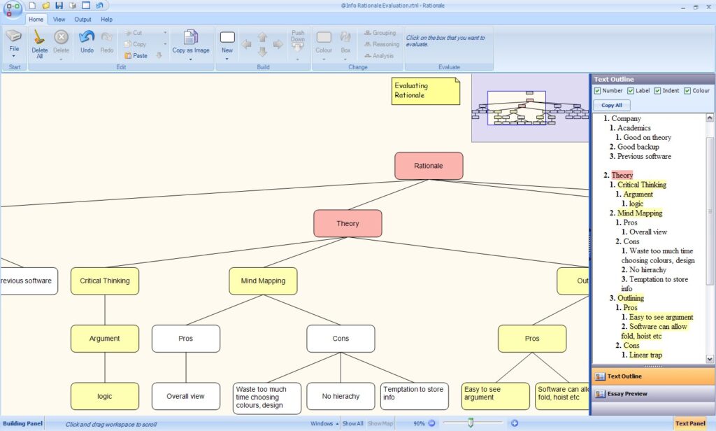
Outside of Rationale, I tend to dither between two methods for elaborating on brainstorms: outlining and mind mapping. The problem is that if I start outlining before I’ve thought my arguments through, the hierarchical view tends to petrify me. I risk falling into a mental rut, stuck inside one argument, unable to climb out to consider others. The problem with non-hierarchical mind mapping is that my ideas flow too easily. The map can grow into a jungle in which I wander around in circles.
Rationale offers the best of both methods. The map gives an overview of the argument. Meanwhile, the textbox, on the right, containing a text outline of the focussed map with numbered and indented headings, subheadings and points, changing dynamically as the map changes, displays the argument in a more linear way.

Clicking on any point in the textbox lights up the relevant part of the map. In a busy page, panning across is a simple task of right clicking and moving the mouse. The mouse wheel zooms in and out of the workspace. As soon as the items spill off the screen, a navigation map opens up. Pressing F8, everything fits in the workspace; F9, the selected map fits the workspace. It’s very easy to use. I’d go as far as to say that Rationale’s navigation is far superior to other mind mappers I’ve tried. And if things are still too busy, I turn the side panels off.
From concepts to arguments
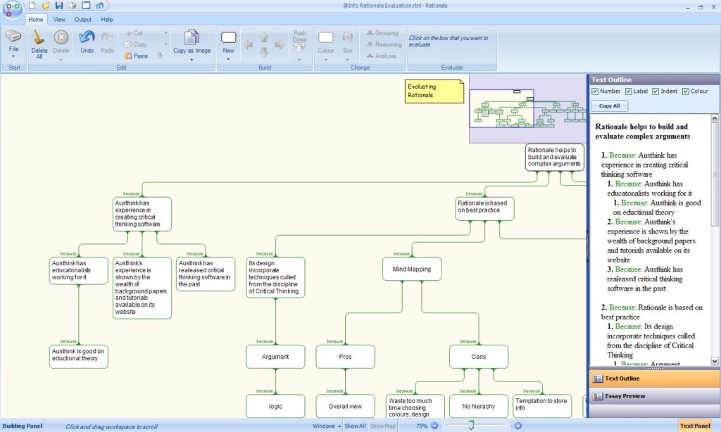
Past brainstorming, Rationale comes into its own. Switching to the reasoning mode, I’m able to refine the map so that instead of showing groups of concepts, it shows a simple argument. Each item is prefaced with “because”. Each item becomes a justification for the claim immediately above it. I don’t know any other mind or concept mapping software which does anything quite like this.

Switching to the analysis mode, I’m able to group items together. The argument becomes more complex, more sophisticated. Being critical here is about being creative. I’m open to new ideas; I’m suspending judgement. I’m tightening up concepts and how they connect to each other.
As I move reasons and objections around, I make major changes to the argument. Or, rather, I find major changes happening. It’s quite an organic process, extremely intense and enjoyable. Like taking part in a seminar which suddenly catches on fire.

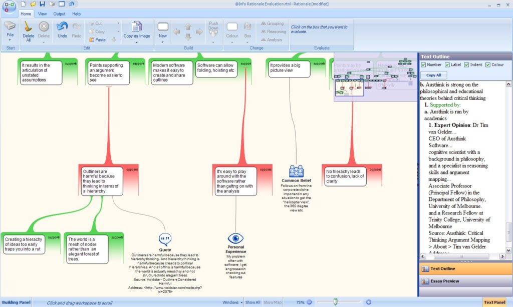
Once the argument seems complete, I start to evaluate my claims. I can accept the claim, reject it or leave a question mark: an appropriate symbol appears over the item; the colours change to reflect the change in status. This is extremely powerful: it brings out the subtleties of the argument. While constructing the argument, it shows where thinking is weak, what new evidence is needed. At the end of the session, it points to where further thinking is necessary, the potential areas for new research.
My first evaluation shows that many of my claims are supported by reasons with question marks: while correct in themselves, they have little bearing on the claims above. I rewrite some, junk some. Where points get ambiguous or contentious, I add notes. Where there’s evidence to back up a claim, I add a basis symbol, a way of indicating what kind of evidence is available.

Rationale helps me realise that I’m quite sceptical about traditional mind mapping, that although I think Buzan-style mind maps are good at giving the big picture view, they take too long to create and can become overly complex. Good perhaps for project management or for remembering a topic, they can’t compete with the clarity of Rationale-like argument maps.
Thanks to Rationale’s quickness, its nimbleness, I’ve only taken around 45 minutes to create and evaluate a map. It’s clearer to me now where I go wrong, where my logic is tired, emotional, liable to slide off its bar stool. Knowing this, thinking about what I need to work on to give my argument greater force, I transfer the argument text over to MS Word.
What’s there not to like?
My big gripe: the evaluation symbols don’t get carried over to the textbox. They can only be exported as part of a map, as a graphic file. I’d like to have the option of taking all my Rationale work as text to MS Word.
I’m not sure if this is such a weakness: while it’s possible to change the background, Rationale offers little else in the way of design options. Colours, fonts, branch thickness: all the design elements are fixed. Since I can’t fiddle with the design, I’m concentrating on thinking through the argument. Which is the point of the exercise. But if I really care about the look of the final map, because, say, I intend using it in a presentation, I have to switch to a more traditional mind mapper.
Other slight gripes: Rationale’s lack of a spell check; moving items around in the analytic mode, the green case has to be deleted manually; there’s no way of linking items; notes can’t belong to two items at the same time; I’d like to be able to save maps as templates.
Recommended
Argument mapping turns out to be fun. Open Rationale. Jot down a few ideas relating to an issue. Drag and drop them to form groups relating to the issue. Tweak into an argument. Evaluate the argument. Realise your grasp of logic is fuzzy. Follow Rationale’s online tutorials. Reiterate until happy. Copy and paste text into a word processor for polishing.
No agony, just ecstasy. Back at the word processor, with a goodish argument running through my points, I find it easy, well, easier, to figure out the right words.
Publisher: Austhink
Licence: Free to try; to buy: lifetime – $166, annual – $83; educational: lifetime – $41, annual – $20
Requirements: Windows 98/ME/2000/XP/Server 2003 with .Net Framework Version 2.0 installed